HOME
WORK
ABOUT ME
CONTACT
click here to go up
click here to go back

image gallery on web.de/GMX

my role: user testing, evaluation, prototyping, conception

situation: much less traffic on image galleries on mobile viewport due to bad usability

table of contents

During the project, the user-centered design process was followed, to create solutions that meet the user's need.

1. Understand the problem

A picture of missing adsA pictures of the current image galleryA picture of missing ads
Entry of the image gallery
one slide of the horizontal image gallery
advertisement slide of image gallery with bad internet connection

user test 1

To understand why web.de/GMX users do not really use the image gallery on their mobile device we did research in the form of a user test. User testing is a crucial step in the product development process that helps to ensure that a product is successful and meets the needs of its intended audience.

  • moderated remote user test
  • n = 5 (32-67y) (five persons find ca 80 % of usability errors)
  • Goal: understand how users use the gallery, see where usability problems occur

Insights of the first user test

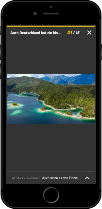
here you can see every state of the image gallery

A pictures of the prototype with problems stated outA pictures of the prototype with problems stated outA pictures of the prototype with problems stated out
Entry of the image gallery
one slide of the horizontal image gallery
advertisement slide of image gallery with bad internet connection
  • users are not satisfied by the visual presentation
  • desktop display looks detached from the page
  • user partially closes the image gallery when they want to click away the advertisement
  • user thinks he has network problems when the ad does not load
  • user does not immediately know how to interact with the gallery
  • users miss the context and information about the individual images
  • users need a thread of content to understand the image gallery
  • users do not know exactly what to expect and if it is relevant for them
A screenshot of the affinity mapping done
This is some text inside of a div block.

goal statement: stakeholder

A goal statement helps to establish a clear focus and direction for the design team, and ensures that all design decisions are aligned with the overall goals of the product or service. Since the image gallery is an important element of the web.de/GMX website we asked various stakeholders and gathered their opinions in a goal statement dedicated to the stakeholders.

"

As an advertising marketer, we want to offer our users an exciting environment in which they can place their advertising well und where high visibility is guaranteed

goal statement: user

Of course we also created a goal statement dedicated for our users. The goal statement is based on the insights generated from the first user test we did.

"

As a user, I would like to be informed in a visually appealing way about a topic that interests me, because purely textual articles require a lot of my attention and I sometimes want to be entertained

2. ideation

How might we?

"How might we" questions are a powerful tool for UX designers because they help to reframe challenges and problems as opportunities for innovation. These questions encouraged us to think creatively and come up with a range of potential solutions, rather than getting stuck on a single idea. By using "How might we" questions, we could generate a diverse set of ideas and approaches, which can lead to more effective and user-centered designs.

A picture of a affinity mapping workshop
Insights of a workshop where several HMW-Questions were examined. Also a voting session is included.

HMW's

after a voting session we concentrated on the following how-might-we questions:

  • how might we help users navigate through the slideshow?
  • how might we provide our users information and context about the pictures they're seeing?
  • how might we provide an easier way to deal with ads?

brainsotrming

The Crazy 8 method is a rapid brainstorming technique that can be used by UX designers to generate a large volume of ideas in a short period of time. This method can be useful for overcoming creative blocks and generating a range of potential solutions to a design challenge.
Beneath you can see a Crazy 8 sketch of mine, pointing out new solutions for the image gallery.

Crazy 8 sketches
Crazy 8 sketch with new features for the image gallery.

3. prototyping

after some round of tweeking and making changes, going through different approaches we ended with 3 different options for the new image gallery: a vertical one, a horizontal free scrolling and a vertical fixed scrolling approach. We tested these variants in a remote user test (n=6) on a mobile device.

Evaluation

I did the evaluation with affinity mapping. It is a method to organize and classify data or information. It helps to identify patterns and relationships within large amounts of data and can be used to generate ideas and inform design decisions. Below you can find the corresponding insights.

key findings

image gallery entry pages

  • informative
  • left: provides useful information
  • right: very emotional, user gets excited
Entry pages for the new image gallery

horizontal prototype

  • arrows as signifiers for interaction
  • expandable text is easily understood
  • difficult for longer texts (due to limited screen-height)
  • ad doesn't lead to an exit
A possible slide for the new image gallery
A possible slide for the new vertical image gallery

vertical prototype

  • scrolling as very easy
  • Users felt more control of the page
  • Users don't like fixed scrolling at all
  • Ad integration was liked
A possible slide for the new vertical image gallery
A possible slide for the new image gallery

4. final solution

for the final solution, feedback from the users is included. These are the features/recommendations for the new gallery:

  • vertical free scrolling for easy interaction
  • white background for appearance "not so dull"
  • short title for the image gallery
  • sub headlines for every slide
  • optimal amount of pictures is 15-30
  • emotional entry with cover is preffered
  • single share function is preffered
A Gif of the final solution

old version for references

if you want to compare to the initial version, here you go!
I'm really happy with the achieved result.

A image of the initial image gallery
photo of color palette